
METAL ICONOGRAPHY
(PART 3)
Welcome back to The Occult Roots of Metal Iconography, wherein we draw back the veil of time and dust to celebrate the obscure artistic heritage of sacred Heavy Metal imagery. It's been a while since I posted one of these, primarily because I've been very busy with my own microscopic record label and guerrilla action group Wyrd War. Be sure to visit the Wyrd War webstore and support our various activities on the frontline of music, art and film. I'll do my part and continue wasting countless hours writing posts like this for your amusement while dirty dishes pile up in my kitchen sink. It's been nice to see that part 1 and part 2 have had some traction and staying power among the true. Obviously, the point of these investigative reports is to uncover arcane reference points and wring even more pleasure from an art form that has already given so much. Astute readers will heed the brief introductions below and seek out the celestial works of all the bands and visual wizards herein. These words you are about to read are merely cairns pointing toward the infinite majestic crags and cavernous jewel-adorned chambers of Heavy Metal. Take this torch! Seek and Destroy! Wimps and posers, leave the blog! So come on...
METALLICA


And here is the original painting in all its diabolical glory, on page 85 of Echoes of Terror.

PICTURE
But that ain't all. His strange in-your-face portrait on page 21 for Poe's Masque of the Red Death was similarly stolen by Dutch hard rockers Picture for the UK pressing of their 1982 LP Night Hunter. I say stolen because the artwork is uncredited on the packaging, and most pressings feature a totally forgettable photo of a chick and a motorcycle (to add to the confusion, the LP was called Diamond Dreamer in most countries). Picture is a pretty lousy name for a band. But you should chase 'em down anyway because, in case you don't already know, they deliver a very potent brand of Rainbow infused jammers and crooner Ronald van Prooijen is an extremely satisfying discount Dio. Drop the needle down on Lady Lightning or The Hangman and watch asses shake. "Women and whiskey are my only friends..." Indeed.


TAIPAN
That same Edwards painting was later swiped by Bullet Records, in slightly modified form, for the 1984 UK repress of the self-titled four song EP by Australia's Taipan (appearing on both the front and back covers). This is an obscure bratty gem, well worth hunting down for sleazy fist pumping anthems Breakout and Tired of You. It's no mystery why they stole the cover art. These songs were originally released in 1981 as a 7" with a truly perplexing rendering of a woman in lingerie wrapped in snakes (taipans, I get it, man) that makes Pantera's Metal Magic mascot look like a Frazetta. It has a certain charm, but the Les Edwards piece below is an undeniable improvement.


That weird face made a slight return of sorts on the 2011 Taipan album Snakes. This was not painted by Edwards, but the "homage" is duly noted. I haven't actually heard it, but I bet it's pretty damn good.

Yet another Les Edwards masterpiece that emerged from the hallowed pages of Echoes of Terror is this crimson eye reaper that closes The Devil's Wager by William Makepeace Thackeray on page 79. How this never turned up as an iron-on decal in the 80s I have no idea (maybe it did?).
PARADOX

Anyway, it crawled from the crypt again in 1989 as the cover of the second Paradox record Heresy. It's sort of a misleading bit of packaging because, despite the medieval Cathars theme, this record stomps around like a slightly more technical Anthrax with classical interludes and hermetically sealed arpeggios punctuating its gang vocals and OCD thrash riffs. It really sounds more like a New Jersey mosh pit than a German graveyard (or French crusade for that matter). Anyway, that cover art rules, eh? I sure hope Edwards got paid because I just looked it up to find an image to stick here and learned that it was re-released on CD in 2015 with the very same artwork.

No occult roots here, but before we move on you should definitely know that Les Edwards also unleashed the rabid cerberus that maniacally guarded the gates to the Cortland, New York underworld where The Rods did dwell in their glory days. Go crank up The Night Lives to Rock and crack another beer.

THE AGNOSTIC FRONT / SODOM / SWEDISH PUNK CONNECTION
Ok, now that we're sufficiently back in the New York Groove, we should talk about Sean Taggart for a moment. S.M. Taggart, or "Stag" as he sometimes signed his work, is my favorite punk cartoon artist from the slapstick early days of NYHC, and if you read part 1 you are already familiar with his work for the legendary Carnivore. He did a ton of flyers and some really good album art in the 80s that you should definitely go check out immediately. He also did this really cool t-shirt design for Agnostic Front in 1986. Very few people saw this drawing back when it first came out because it was a very limited edition tour shirt, but doesn't it look familiar?

About one year later Sodom released Persecution Mania, one of my favorite German thrash records from this or any other decade. Their "political" album is nothing less than a savage declaration of blunt head trauma delivered by nuclear barbarians who are seemingly too obsessed by beer cruelty to bother praising Satan, or keeping up with Witchhunter's off the rails bludgeoning for that matter. I spent more time than I care to admit pondering how this startling cross-continental similarity could have come to be. Spoiler alert: Neither Sean Taggart nor Sodom's cover artist Johannes Beck had ever seen each other's work. The secret is actually not very scandalous...

They both just happened to use the very same World War II reference photo! In fact, a blown-out Crucifix style xerox version of this same image had already appeared on a ripping EP by Swedish punkers Arroganta Agitatorer way back in 1983. I have no idea what these kids were screaming about, but I bet you can find a few things about our recent election that will somehow apply very nicely to their snotty buzzsaw protest anthems. Go blast it right now while you contemplate the importance of finding extremely obscure reference material for your artwork.

LEGEND
Now let's hop on over to the other Jersey, and take a look at the cover art for soulful NWOBHM unknowns Legend. In 1982, on the heels of two full-length LPs, the band released this awesome four song EP, which featured an incongruous and sorta incomplete looking eyeball cover painting.

I'm not sure exactly what's going on here, but it seems more than coincidental that the very same window pane is reflected in the cornea of this eye as was reflected in the eye(s) of British illustrator Paul Woodroffe's very cool 1974 book sleeve illustration for Brian Aldiss's history of literary science fiction titled The Billion Year Spree. It's clearly not the same painting, but the odd jagged framing does seem to suggest that Legend's cover artist wasn't able to imagine anything beyond the melting wax of Woodroffe's original inspiration. Maybe these artists just happened to have exactly the same idea and painted their eye(s) in exactly the same room by the exact same window. Then again, maybe Legend was on a tight deadline.

While we're on the subject of the brilliant Paul Woodroffe, you should also be aware that one of the few album covers he painted during his very successful decades long commercial art career was one of the greatest heavy metal albums of all time:

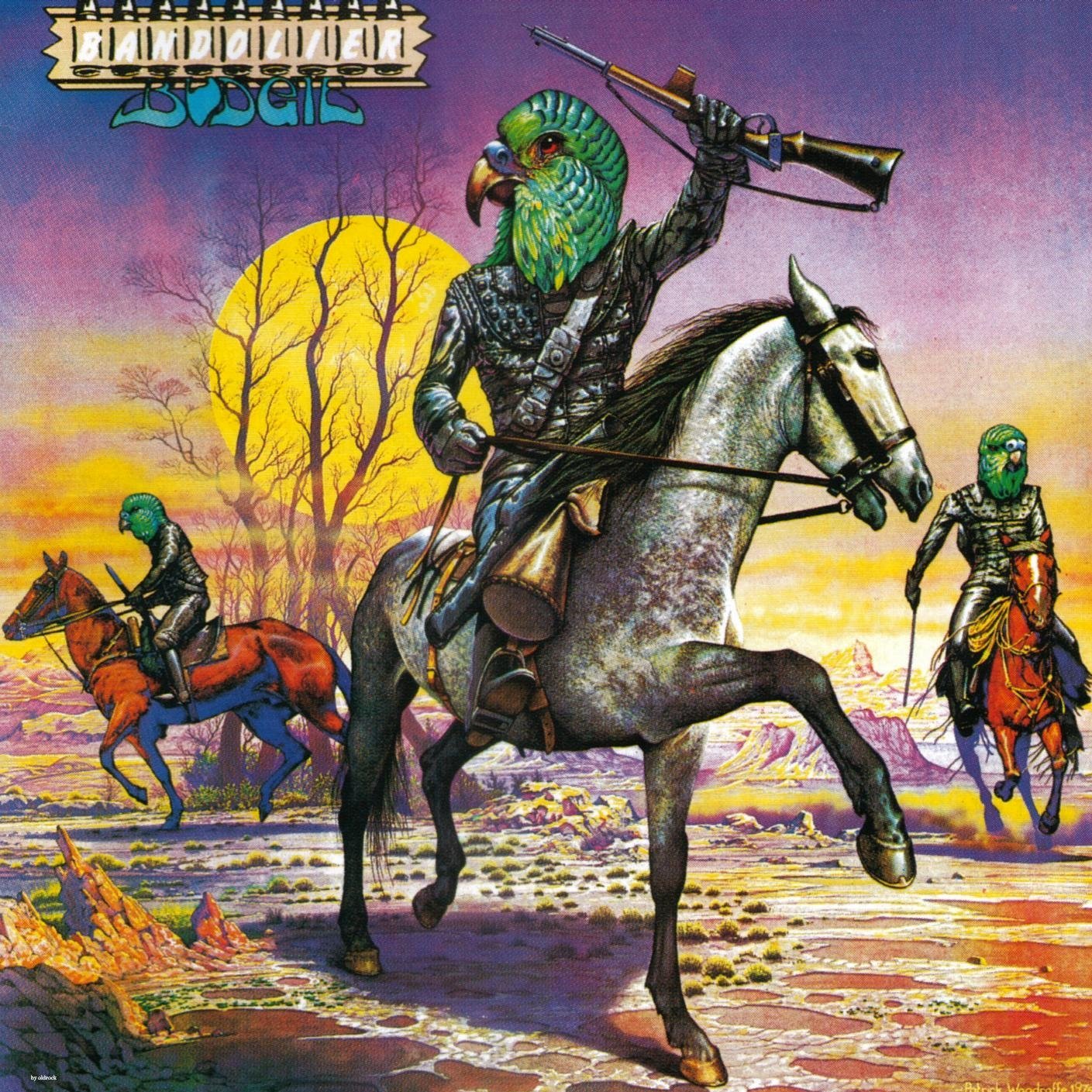
He also did this fun spoof on Planet of the Apes for Budgie.
Stagnation of the Heart is one of my favorite pieces by Woodroffe. It was rendered with acrylic gouache, crayon and ink as one of two variations he did for the cover of the 1974 publication of a sci-fi collection titled Four for the Future. It was clearly an influence on later Brit shit-stirrer Trevor Brown, who took Woodroffe's quaint psychedelia (that background pattern is actually Bridget Riley's optical invention) and those pulmonary trunks in an altogether...cough, cough...different direction. Look up Trevor Brown when you're not at work.

Eventually Woodroffe's masterpiece made an unceremonious and uncredited appearance on this very sketchy bootleg box set that not only misspelled the word metallurgy, but also mislabeled the Venom and Iron Maiden tracks and boasted nary a production credit. It's pretty hard to find, but at least now you know who painted that killer cover art: Mr. Paul Woodroffe, whom Warren Publications once glowingly heralded as "England's Dean of full-color fantasy!"

MISFITS
My adoration of Glenn Danzig's entire creative output from roughly 1977 through 1992 is unbounded and well documented (all documented, all true!). Just in case you haven't been reading this blog for a while, you should check out Part 1, and also this and this and this and this and, lastly, this. Anyway, here's Danzig's classic drawing for the posthumous Misfits 12" Die Die My darling. What a GREAT fuckin' record!

And here, of course, is Chamber of Chills #19 from 1952 with awesome Lee Elias artwork that Glenn unabashedly swiped, more or less unedited (he did make the cleavage more prominent and removed the reaper's tux). Can't hardly blame him.

ONSLAUGHT

Next up is this micro-classic from Onslaught. I don't remember many people caring about it when Pushead first released it in the U.S., but, boy, it sure has captured the imaginations of spiky sods in the decades that have passed since 1985. In case you don't already know, this is a crushing record by contemporaries of English Dogs that united the bulletbelts and longhairs, like a Discharge cover band playing a kegger at the trailer park down the street. From the moment this one roars open with wind, bells and that Destruction style narration you know you're in for a righteous blast of thermonuclear devastation as only toothy Brits on the dole could deliver. I'd wager your entire sleeveless Toxic Holocaust t-shirt collection that you didn't know where that amazing cover artwork came from...

All hail and bow before the morbid master, Manuel Sanjulian, who painted this beautiful demonic menagerie for Eerie #41 in 1972. It later reappeared on the cover of issue #1 of the short-lived Warren fantasy anthology Ring of the Warlords in 1979. Now you know.

Here's another fun fact: the skullcrusher from hell was conjured again for Onslaught's 2007 album Killing Peace. In fact, the shadowy silhouette of the demon's grim visage was actually sculpted by an artist named Josh Cook. You can read about it here and marvel at how awesome his work was before it was obliterated with that high contrast "design" work. And here's the final packaging. Meh.


COVEN / GOBLIN
Speaking of demons, let's move on now to an infernal conundrum that has racked my brain for many years. Which came first? Goblin's Roller or Coven's Blood On The Snow??? They were both released in 1974! Does anyone know? Does anyone care?? Arrrggghhhhh...

One thing's for sure, both of those records came before the 1977 Attic pressing of Goblin's brilliant Suspiria soundtrack...

We have masterful 19th century French autodidact Louis-Leopold Boilly to thank for all of this devilry, and the inspiration for his beautiful 1825 piece Le Songe de Tartini (or 'Tartini's Dream') is a tale of possession worth sharing. Giuseppe Tartini was an 18th century Venetian violinist and composer, and, incidentally, the first known owner of a Stradivarius. His most famous composition is known as the Devil's Trill Sonata (or by its more boring title 'Violin Sonata in G minor') due to its technically difficult passages that apparently still perplex players to this day. In fact, there was a popular rumor during his day that Tartini was born with six fingers which allowed him to play this intense sonata with seeming ease. Tartini himself claimed that he was visited by the devil in a dream, who became his servant and bestowed this composition upon him through a Satanic pact. Keep in mind, this was nearly 200 years before Robert Johnson was reputed to have met Ol' Scratch at some Mississippi crossroads in the form of a big black dude who tuned his guitar and handed back to him the key to proto-rock 'n' roll. Anyway, this is how Tartini told the story:
"One night, in the year 1713 I dreamed I had made a pact with the devil for my soul. Everything went as I wished: my new servant anticipated my every desire. Among other things, I gave him my violin to see if he could play. How great was my astonishment on hearing a sonata so wonderful and so beautiful, played with such great art and intelligence, as I had never even conceived in my boldest flights of fantasy. I felt enraptured, transported, enchanted: my breath failed me, and I awoke. I immediately grasped my violin in order to retain, in part at least, the impression of my dream. In vain! The music which I at this time composed is indeed the best that I ever wrote, and I still call it the "Devil's Trill", but the difference between it and that which so moved me is so great that I would have destroyed my instrument and have said farewell to music forever if it had been possible for me to live without the enjoyment it affords me."

ORANGE GOBLIN
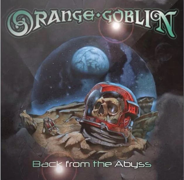
Can't say I'm an Orange Goblin fan. Saw them a few times over the years and always wanted them to be...more...somehow. Their artist stole the main composition of this album cover from the great poster art from the great underrated 80s flick Def-Con 4, which I happen to love. It's a little slow-paced, but it has a very brooding and very rewarding soundtrack with a particularly beautiful track titled The New Dark Age. Here's the original poster by Rudy Obrero (the man responsible for the Mad Max 2 a.k.a. The Road Warrior poster art, among others):

Doh! And here is Angus McKie's original illustration which appeared in 1976 on the cover of The Year's Best Science Fiction #8 and on the cover of The Flights of Icarus in 1977. Moving right along...

STREET CHILD

Man, if anyone ever stumbles across a copy of this Street Child EP from 1989, you know where to send it (po box 40667 portland, oregon 97240). I've never seen a copy in real life, and even the goddamn 2010 repress goes for stupid amounts of money. Here are four truly obscure and truly strange traditional metal gems with soulful vocals and even a few gang chants here and there. They even have a plodding melodic "whooa-oooo-oooohhh" election season anthem called Building a Wall (too soon?). The problem was, in 1989 thrash was still the alpha dog of the day, and atmospheric stuff like this was waaaay too slow and noncommittal to make it through the wall of endless speed riffs, even when they got sorta tough on Erotic Insomnia (What? Like you've never been afflicted with the nocturnal scourge known as erotic insomnia!). The artwork was an airbrush rush job, the likes of which could be seen in cooler malls all around the U.S. during the late 80s. There was a dude with a big hoop earring and a beret at the Galleria near us that banged out shit like this and replicas of Black Out on white Fruit of the Looms for, like, $20 a pop. Like any young stud who suffered erotic insomnia during this era, Street Child's artist was an unashamed disciple of our Lord and Deliverer, his Eternal Champion of the Battleaxe Brush, Sir Frank Frazetta. Here is the original 1967 Frazetta painting that he ripped off. It's titled Pony Tail.


All those people thanked on the back cover and Frazetta ain't one of 'em. They even gave two people credit for the "original cover concept." C'mon, Jesse Odom. Your voice is an iron fist wrapped in silk, but you definitely didn't invent this graphic concept. Anyway, if anyone ever finds this awesome Street Child EP accidentally languishing in some dusty discount crate, send it to me...stat!
THOR

Just thinking about Frazetta made me drop down and knock out some incline push-ups while blasting my autographed copy of the Rock 'n' Roll Nightmare soundtrack. Which brings us around to Canadian metal supremacist, Thor. Jon Mikel Thor is one of the nicest true believers I've ever had the pleasure of meeting, and I am honored to call him friend (he doesn't respond). One time he asked me and my lady to help with his merch table and when he sold out of shirts he took off his personal hockey jersey and we sold that to an eager fan too. If you're one of those frowning "occultist" types who thinks Keep the Dogs Away is a novelty record...fuck off! Heavy metal as mighty and triumphant as Thor requires mighty and triumphant artwork. But if you're Jon Mikel Thor, you're also on a pretty tight budget. So his artist rightly turned to Frazetta and took his best shot at this bad boy...


Doesn't that Metal Avenger look damn similar to Frazetta's Dark Wolf character from Ralph Bakshi's 1983 animated sword and sorcery epic Fire and Ice (Black Wolf was, of course, a nod to Frazetta's beloved Death Dealer)? My older brother took me to see Fire and Ice the day it came out when I was 11 years old (at the same mall where the dude with the beret used to airbrush, now that I think about it) and it made a permanent impression. We had already seen Lord of the Rings in the theater a few years earlier, and I've been a huge Bakshi fan ever since.

BITCHES SIN
You're already quite familiar with Edvard Munch's most famous painting, right? You know the one. People call it The Scream for ease of reference, but the artist preferred to leave it untitled. Surely your mother has a magnet of this painting on the fridge. Munch actually painted four versions of this same existential obsession between 1893 and 1910 (thanks, Wikipedia!), with varying degrees of delirium and swirling chromatic Van Gogh skylines:


The real question here is which version did Bitches Sin copy for their third demo in 1983?? I bet you didn't know your mother was a fan of third tier NWOBHM.

Poor Bitches Sin. These guys just couldn't catch a break. The mags and fans doted over them, and they bashed out some pretty good songs for a few short years, before things fell apart in a torrent of lineup changes and missed opportunities. Which is a shame because the Toomey brothers could really tear it up! The dude who scribbled out this new version of Munch's The Scream for the cover of their second LP Invaders in 1986 didn't even bother signing his work, and the band didn't bother mentioning him in the sparse back cover credits. They did, however, include a photo of themselves dressed as Sheiks staring up at a Crayola version of the Bitches Sin spaceship from the debut LP Predator. Hmm. I can't believe that didn't catch on. For comparison, consider that in the same year, Maiden released their own little futuristic themed record called Somewhere in Time. Ain't life a bitch?

DANAVA

Have you heard the new Danava 7" yet? You really should. In some ways it's an homage to the days of classy hard rock singles, with a total ripper on Side A and an incongruent surprise on Side B. Seriously, go grab a copy now if there are any still floating around out there. I hear the first pressing sold out in a couple weeks. Anyway, above we have a t-shirt design that Danava main man and onyx-eyed whiskey wizard Greg Melaney whipped up a couple years ago for one of their notorious cross-continental benders. And below is the original source of "inspiration" from 1981 (one year after Bon Scott drank a hole in the time/space continuum and bid this world a fond fuck you). Greg tells me he was surprised so few people picked up the reference. In this case it was intentional and was very much a tribute to AC/DC and a reference to some of the shit that was stirring up in their camp at the time. For those about to smoke rock...

IRON MAIDEN
Let's wind things down with a tribute to one of the many legends we lost in 2016.

Nic Roeg's 1976 film The Man Who Fell to Earth is a fantastic work of alienation and beauty featuring David Bowie in the perfect role as the titular and well coiffed extraterrestrial. If you haven't already seen it, do yourself a favor and go get stoned and watch it right now. Does illustrator Vic Fair's typography for the poster look familiar?

You rivetheads probably don't recognize it because this band Iron Maiden from England is pretty underground and cult (I think they pronounce it ī(-ə)rn mā-dən). Trust me, they're gonna be real big someday. Their eponymous 1980 debut LP featured one of the best record covers of all time by Derek Riggs and the band's logo, which has appeared unchanged on every release since, was originally hand drawn by bassist Steve Harris himself...apparently after he saw Vic Fair's amazing poster art. R.I.P. Starman. UP THE IRONS!!!!

SATURNALIA TEMPLE

It has become something of a cruel tradition to end these installments with an embarrassing exposition of my own work. Lately I haven't been drawing much because, as I mentioned in the introduction, I am very focused on my label Wyrd War. So, here is a reveal of an old drawing I did for the great Swedish left-hand pathists Saturnalia Temple. This one was pretty self-referential because the band asked me to do something similar to the drawing I did for Bobby BeauSoleil's Lucifer Rising Suite box set a few years earlier, which in turn was inspired by Rick Griffin's original poster art for Kenneth Anger's short film. Take a look:


Now you can clearly see the evolution (some might say, degeneration) from Rick Griffin's 1967 drawing, with Gustave Doré centerpiece, to my ballpoint rendering with Bobby's color pencil centerpiece, to, just a few years later, this ballpoint drawing...


I knew this work needed to be infused with an infernal presence, and what is more Stygian than the mouth of Glenn Danzig? The inverted mouth of Glenn Danzig! Whoooooaaaaaahhh! Yeah!

Gotcha!
Until next time, remember: Heavy Metal never dies. Heavy Metal never bends. Worship at the altar every day and every night. Fight Till Death!